

In my last article, I provided some tips on how to build a better email newsletter. But what if, after spending all that time designing your beautiful newsletter, Microsoft Outlook doesn’t render it correctly?
It’s a common issue, unfortunately. Unlike other email providers, Microsoft Outlook relies on the Microsoft Word rendering engine, which comes with a number of limitations that other rendering engines simply do not have.
As a front-end developer who specializes in email and landing page development, I’ve encountered just about every rendering issue out there. To make life easier for myself and my clients, I’ve come up with some preemptive workarounds to head these little email nightmares off at the pass. In case these can help others, I’m sharing four of the most common email rendering issues in Microsoft Outlook — and how to fix them.
1. Hiding mobile-only content.
Your mobile design looks great — as long as it doesn’t also show up when someone opens up your email on their desktop or laptop. Unfortunately, Outlook does not recognize “display: none;” or any other handy CSS method of hiding sections of code:
When it comes to hiding mobile-only content, the above code works everywhere except for Outlook.
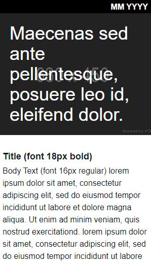
So, if you’ve created different headers for mobile and desktop devices, both headers will display in the desktop version in Outlook:
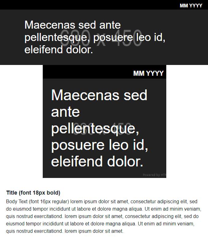
An example of both mobile and desktop versions of the same header appearing one right after the other in Outlook.
How to fix it:
The key is to convince Outlook’s rendering engine to comment out the mobile-only content. The most straightforward way to accomplish this is by placing a div around the mobile-only content with a mobile-display class and inline CSS styles setup to hide it, as you normally would. Then, surround the div with a commented code snippet that targets Outlook’s rendering engine. This snippet includes the start and end of HTML commenting, causing Outlook to hide the section:
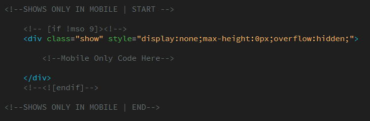
Use this workaround when you want certain content to only show up on a mobile device.
See the grayed out comment above beginning with [if !mso 9]? You’ll need to be sure to include that and the commented closing tag at the bottom <![endif]>. The “if !mso” logic hides it from Outlook by “commenting it out,” whereas the div hides it everywhere else.
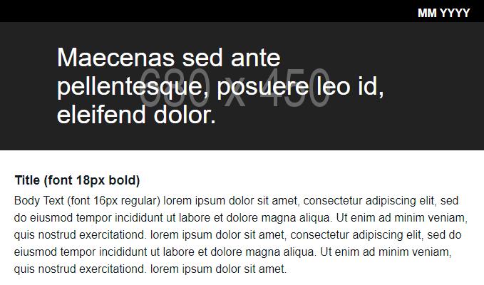
Wrapping the code around the mobile-only header ensures that desktop only shows the desktop version and mobile only shows the mobile version.
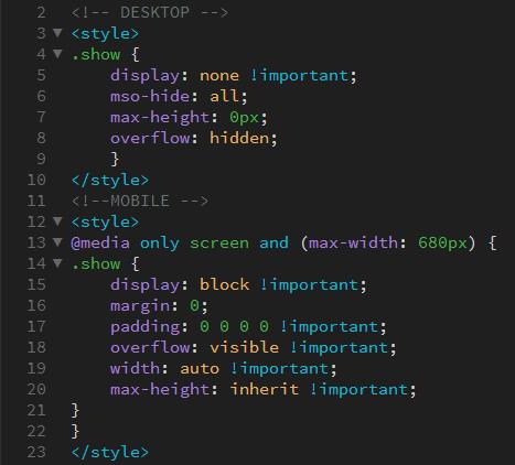
Now would also be a good time to ensure that you’ve set up your media queries correctly. I’ve pulled out the relevant code, which begins with “@media only screen,” from the original screenshot below:
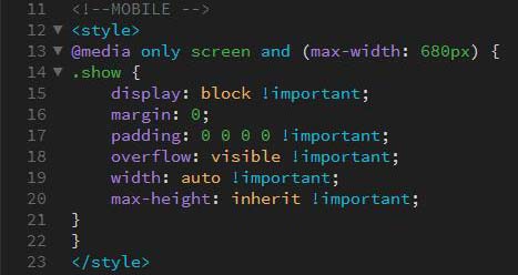
Using the class “show” displays hidden content on mobile devices.
2. Removing horizontal lines between email sections.
Ever think your email was ready to go, and then pre-launch testing shows unexplained horizontal lines the same color as your background cutting across different sections of your email?
Where did that horizontal line come from?
Microsoft hasn’t provided an official reason for this particular issue, but people within the email development community have found it’s often linked to line height and font size (although there have been other documented causes).
How to fix it:
There are a few best practices to follow when creating your email that will hopefully prevent this issue from occurring in the first place:
- Keep your line-height and font-size divisible by two: This unwanted horizontal line tends to happen most often in email sections with an odd number of font sizes that won’t scale evenly.
- Make sure you don’t have line heights where they don’t need to be: You can do this by making sure that line height and font size are only set in the table cells that actually contain text.
- Surround the container of the email in a table, and set the background color as both an HTML property and as inline CSS: If the first two potential fixes don’t pan out, try this one next. Surround your entire email in a table and set the background color as both an HTML property (bgcolor) and through inline CSS (table style):
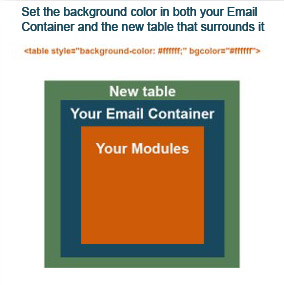
All emails must be created using tables, primarily due to a limitation within Outlook. In the image above, Your Modules are the individual rows of an email, which must be contained within a table (Your Email Container). By putting another table around that (New table), like a set of nesting dolls, you can make sure your email displays the appropriate background color between the gaps created by this issue.
- Change the background color of the
<body>tag to match the section in Outlook: If the horizontal line seems to be populating the background color from the email’s body tag — regardless of the background color of your email container — you’ll need to change the background color of the<body>tag to match the section the horizontal line is appearing in (but this change will only appear in Outlook). Simply put this code snippet into the head of your email beneath your other styles:
<!--[if (gte mso 9) | (IE)] -->
<style type="text/css">
  body {
   background-color: #ffffff !important;
  }
</style>
<![endif]-->
These troubleshooting methods will fix the issue in the majority of instances, excluding an unexpected horizontal line between images, which I’ll cover next.
3. Removing horizontal lines between images.
Unintentional horizontal lines between images probably happen more often than people realize — but they only notice them when they need to create image slices.
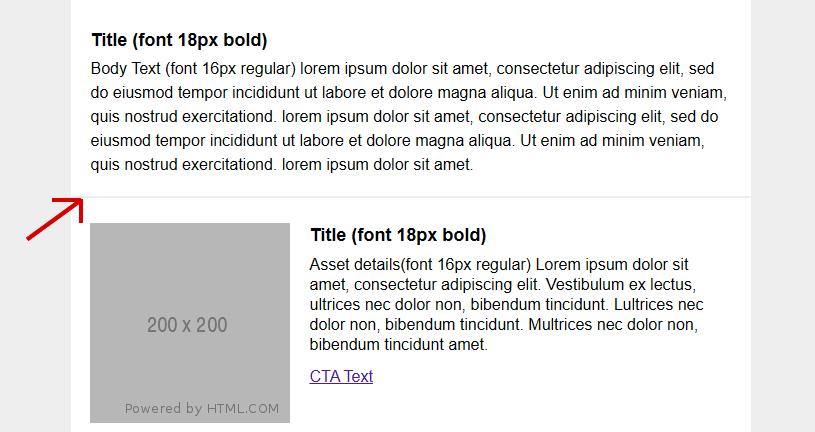
This issue is caused by Outlook’s image scaling. To keep it simple, Outlook converts some elements from px to pt, and will then sometimes round these values up or down, causing a 1px line break. As a result, not everything will be scaled evenly, and the table cell that the image is inside of might end up scaling 1px or 2px larger than the image itself. Depending on how the tables are nested, the line break could be as big as the example below:

Outlook is trying to be helpful by inserting gaps in between image slices. (In the example above, the left column has one image slice and the right column has three).
This issue also often pops up in a banner that has multiple calls to action — but must remain a single image.
How to fix it:
- Images slices must be made in increments of 10px: This will ensure proper rendering, and prevent the rounding issue from occurring. If your design team sends you something that’s 116px tall, for example, the best course of action is to create slices adding up to 110px, losing the extra 6px from the top or bottom. You should also communicate this need to the design team, so that they can supply you with assets that won’t need to be trimmed down.
- Images must always be set to
display:block;: For the above and other reasons, your images should always be set todisplay:block;. Displaying images at the block level will prevent additional, unwanted, styling from being applied to them, including ugly gaps being placed below them. This always needs to be done though inline styling (img src="source.png" style="display:block;"), as some webmail clients will ignore display settings contained in a<style>tag, but will always respect inline styles on the element itself.
If you’re still experiencing scaling issues, add this code to the top of your HTML (it will address many of Outlook’s internal scaling issues):
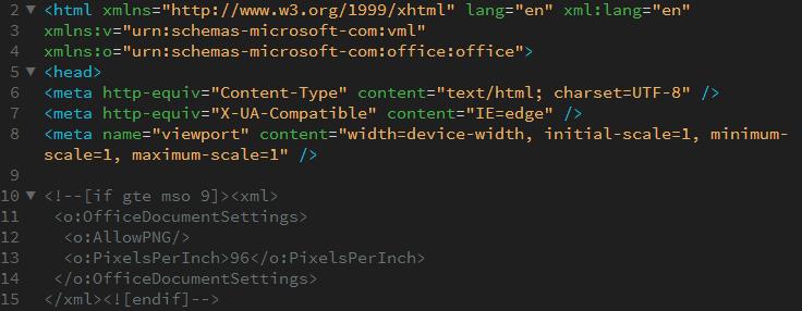
You can copy and paste this code into the top of your email:
<html xmlns=http://www.w3.org/1999/xhtml lang="en" xml:lang="en"
xmlns:v="urn:schemas-microsoft-com:vml"
xmlns:o="urn:schemas-microsoft-com:office:office">
<head>
<meta http-equiv="Content-Type" content="text/html; charset=UTF-8" />
<meta http-equiv="X-UA-Compatible" content="IE=edge" />
<meta name="viewport" content="width=device-width, initial-scale=1, minimum-scale=1, maximum-scale=1" />

<!--[if gte mso 9]><xml>
<o:OfficeDocumentSettings>
<o:AllowPNG/>
<o:PixelsPerInch>96</o:PixelsPerInch>
</o:OfficeDocumentSettings>
</xml><![endif]-->


 <!--rest of email header here -->
</head>
<!--email body here-->
</html>
4. Eliminating extra padding between table cells.
Outlook has a tendency to equalize top-padding between table cells — even if those cells are in different rows. As a result, applying padding to the top or bottom of a single table cell will convince Outlook you want that same padding applied to the top and bottom of every other cell inside that table.
How to fix it:
There are two ways to address this issue:
- Nest a new table inside the cell and apply the desired padding within this new interior table’s
<td>: Instead of applying padding directly to a table cell, nest it inside of a new table first. I’ve created a visual aid to help describe this concept below:
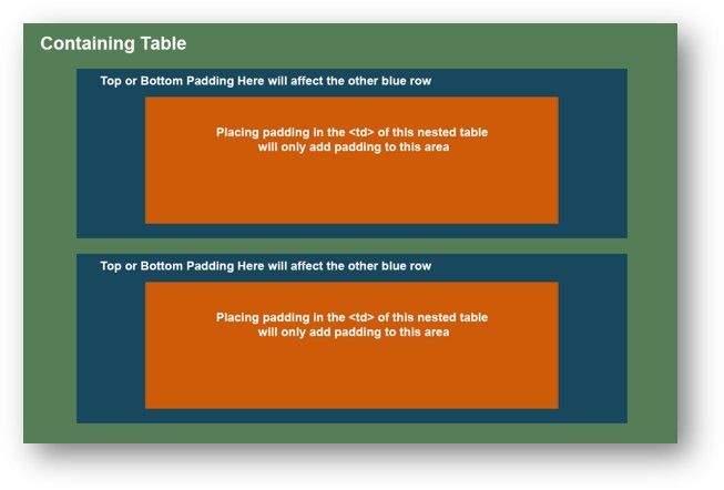
Applying padding to a table cell (blue) will apply the same padding to similar cells in the same table. Instead, nest a new table (orange) inside the cell and place padding in the <td>.
- Add a spacer row. Create a new row with a non-breaking space where you want spacing and set its height to create a padding effect. This method is much more straightforward than inline padding and does not create nearly as much bloat in your code.
When using a spacer row to create padding, you will find that Outlook sometimes increases the size of this row. This is because Outlook wants to scale up table elements with a set-height below 20px. This adjustment from your desired height to Outlook’s 20px recommendation can ruin the look and flow of your email. Preventing this from occurring is actually very straightforward. You just need to set the height as both an HTML property and inline style. This will negate the scaling effect and allow you to place as many sub-20px spacers as your design requires.
Add this code to create a spacer row:
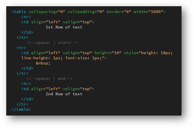
You can copy and paste this code into your email:
<!--spacer | start-->
<tr>
<td align="left" valign="top" height="10" style="10px; line-height: 1px; font-size:1px;">
</td>
</tr>
<!--spacer | end-->
Getting your emails just right
Sometimes, it’s just easier to bring in some outside help to get the coding right so you can focus on being creative. Learn more about our campaign development and execution services — we can assist with as much or as little as you need to ensure your email campaigns are flawless.
 Jared Claunch is an email developer with several years of experience creating high-performing emails and landing pages for a large variety of businesses and industries. He specializes in the creation and implementation of powerful, responsive email templates with a focus on scalability and user experience.
The post 4 Common Email Rendering Issues in Microsoft Outlook and How to Fix Them appeared first on DemandGen.


