

Let’s talk about accessibility in email. Email accessibility seems to be one of those topics that companies either don’t consider, don’t think it applies to email or assume they are already implementing. When accessibility is brought up in a discussion, it is often set aside for a later discussion or next-round implementation due to a misconception in the level of effort it can take to implement.
Making our emails accessible not only helps to comply with laws and regulations, it also allows everyone the ability to see our messages as we intended. Fortunately, there are a few easy practices around fonts, colors and images that we as marketers can do to bring our emails into compliance for accessibility without adding to our budget. Let’s dive in and make our emails better for everyone.
Best Practice #1: Check Your Fonts for Readability
Using hard-to-read fonts is easily one of the biggest branding mistakes I see when it comes to accessibility. Many times, designers provide a list of brand-appropriate fonts without taking readability into consideration. Some fonts are too thin, too light or don’t have sufficient spacing to be used effectively or read easily. A font may look great at larger title sizes, but when reduced to basic copy size (typically 14px) they become thin, light in color and generally hard to read.
In these cases, it’s fine to use the official company font for titles, headlines and other larger text locations, but for the body copy it’s better to stick with a common system sans serif font (Arial, Calibri, Verdana, etc.). By using a common system sans serif font for the body copy, we can (almost) guarantee that all of our readers will be able to experience our email as we intended. There will be fewer problems with email clients, less required coding to display the font and fewer issues when using or laying over color.
What is the difference between serif and sans serif fonts? Serif fonts have little wings on the letters and are not always evenly spaced, which can make them difficult to read for those with vision impairments. Sans serif fonts, on the other hand, do not have the wings and are typically evenly spaced, making them easier to read regardless of the size (within reason). Here is an example:

Many people avoid the common system fonts like Arial because they believe they are overused — which they are, but for good reason. All email clients recognize common system fonts such as Arial and Verdana, which means they will display consistently across all email clients and browsers.
What if we want a font with a little more character, but we’re unsure if it will be accessible for our readers? We test the font. A clear indication there will be issues is if we have to bold everything (especially body copy) just to read it easily. If that’s the case, we know it’s a font to avoid.
If you want to do a deeper dive into font usage, check out this great blog by Brafton. Meanwhile, here is a simple breakdown of the kinds of fonts to avoid when considering accessibility:
- Script/handwriting fonts. The use of these should be limited to shorter pieces of copy and confined to specific use cases, like galas and high-class events.
- Decorative fonts. Though these can be fun and effective for branding, they should be limited to logos and images (such as in headlines, banners, etc.).
- Comic Sans. Just don’t…
- The letters are close together, which causes issues with reading text, especially at the smaller font sizes used in emails.
- Times New Roman or any serif font. The little “wings” on the letter can make copy at a smaller font size difficult to read. (Take note: If you’re using Microsoft tools, Outlook doesn’t recognize the custom font in use and will default to Times New Roman regardless of the font family stated.)
Best Practice #2: Contrast Your Colors
I cannot tell you how many times I’ve seen a company make their email text difficult to read by using a light font color on a colored background. This is a very easy error to make, especially in footers with legal copy. Remember that even when the contrast looks good to us and our team, it may not pass an accessibility check. If we aren’t careful, this issue could alienate some users in our lists that may have a vision impairment, or even land us in hot water with the legal team if someone complains the email is not accessible. This occurs more often than most marketers realize. In fact, if you were to check your inbox, I’d bet you have at least one email with this kind of hard-to-read text somewhere in their copy.
An example of poor contrast for readability would be a gray or white font over a medium to light gray-colored background, such as in these examples.
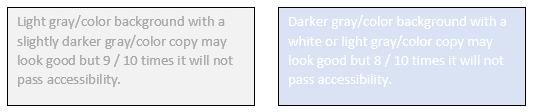
To avoid any issues, use a dark-colored font on light and white backgrounds. For dark backgrounds, use a white, light gray or a pale font color. To verify you are in compliance, make sure to run an accessibility test. I highly recommend checking emails in the free WAVE Web Accessibility Evaluation Tool. This is my go-to accessibility checker as the results page is very easy to read. While this tool is meant as an accessibility test bed for web pages, it’s equally useful for HTML emails. I simply select the “view in browser” link of a sent test email and drop it in the web page address bar on the site. (Browser extensions are available as well). Within the results, focus on contrast errors, alt text, font size, etc., and keep in mind that most of the “coding” issue section won’t apply to email.
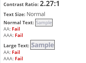
Here is a results page for a client’s footer as an example:
Best Practice #3: Consider How Images Are (and Aren’t) Seen
As marketers, we need to start considering that not all of our readers will see our images and emails. In some cases, readers may use a screen reader to view their email. Additionally, more companies are starting to block images at the server level as a security measure. In these cases, those users won’t see our images unless they send the email to their personal address, load the images manually (if available) or white-list the domain (if available).
ALT tags to the rescue! ALT tags are widely implemented by coders of templates and applied by marketers currently; however, ALT tags aren’t always applied effectively. Instead of using descriptive text, I often see general language that doesn’t explain why the image is relevant to the email message. Some of the unhelpful ALT tag descriptions I’ve seen used are as follows:
- Image, Video, Asset.
- Headshot.
- Banner.
- Some version of a placeholder text that doesn’t get updated.
I applaud web designers for taking the first step by spending a few seconds to add the ALT tag to the image link when coding templates — now we just need to apply them more thoughtfully. Use a brief description of the image instead of generalized text, like the examples above. Instead, use your ALT tags to specify what your recipients would be looking at if they could see the images. Here are some examples:
- Use a person’s name instead of “headshot.”
- Use the video or asset name instead of “asset” or “video.”
- Use the embedded copy of the image (when it exists).
- Use “decorative image” or provide a short description for general images that exist for aesthetic or branding purposes.
- For spacer images, leave the ALT tag blank.
There are workarounds for embedding copy in images as well, but these typically need to occur at the template level. The template coder can add a section or module that has the image on one side and the copy on the other. Another option would be to use a background image with copy over it, but that opens up a whole other can of coding issues with email clients. Or, as mentioned above, we can include the image copy as the ALT tag text. This option is probably our best option since it doesn’t require any code changes.
Best Practice #4: Test, Test and Test Again
I cannot say this often enough — we must always test emails. At the minimum, we should send tests to our work and personal emails and have someone else run a quality assurance (QA) check to catch anything our eyes might have missed. With these two practices alone, we can catch the most common issues, like formatting, layout and yes, even accessibility issues before the email sends. This helps us to avoid the dreaded “oops” email, frustrated bosses or worse — reader unsubscribes.
Make sure to view tests with images on and off. With images off, we can see if or how much of our ALT tag is displaying. Keep in mind that ALT tag text that is longer than the image width may or may not appear. Also know that linked-image ALT tag text may or may not appear, depending on the email client.
Other Testing Options:
- Litmus. https://www.litmus.com/
- Email on Acid. https://www.emailonacid.com/
- WAVE. https://wave.webaim.org/
- Text versions of emails.
We’ve covered four best practices for establishing accessibility in email, but there are a lot more. Unfortunately, a couple of these items, such as fonts and colors, may go against some companies’ brand guidelines. This is primarily because accessibility wasn’t brought up during the branding conversations. It’s worth our time to raise any issues with our company’s design or branding teams so we can arrive at a standard policy that fulfills their vision and helps to meet accessibility needs.
If you want to do a deeper dive into email accessibility, fire up your favorite browser, Google “email accessibility” and be prepared to go down a very deep rabbit hole. To dive into more winning marketing automation practices by my amazing colleagues at BDO Digital, check out more of our resources. Now let’s all get out there and make our campaigns great for everyone!

As an Implementation Architect at BDO Digital, Lori Mann works on integrations, nurtures, production, deployment and more within Eloqua and Marketo. She has a deep passion for email design and web design and development.
The post Four Best Practices for Accessibility in Email appeared first on DemandGen.


