

In the digital era, data has rapidly evolved from something that was scarce, expensive, and relatively difficult to gather and collect into something that is abundant and cheap, but difficult to process and understand. After all, data is only as good as both its quality and the ability to translate it into information that can be understood and leveraged to make smart business decisions.
Instead of driving your business forward, however, data that cannot be understood can become a burden. Terabytes take up precious (and expensive) storage space while your data degrades at an annualized rate of 22.5 percent as your contacts change roles, leave companies, and retire.
This gave birth to the concept of “Big Data” and the evolution of software to capture, store, and analyze vast amounts of information. This, in combination with machine learning, led to the creation of predictive analytics to help surface the raw value of such massive data volumes.
Still, this raw information can be very obscure and difficult to understand. That’s where data visualization, which processes all that raw data and displays it as easy-to-understand charts, graphs, images, maps, and other visual assets, comes in.
You may be thinking, “Oh, it’s just like the pie chart I used in my last presentation, or the bar graphs I include in my budget utilization reports.” You would be correct, but those examples only scratch the surface of the capabilities of data visualization tools to quickly and intuitively present complex information.
What makes data visualization so effective?
We live in a visual culture and are naturally wired to be drawn to colors and patterns. In fact, it’s estimated that up to 90 percent of the information that is processed by the brain is visual.
Data visualization tools are essential for both processing massive amounts of information and providing an easy-to-understand visual representation that explains the numbers and allows for easier consumption and interpretation.
Most of us can relate to how difficult it can be to tease out trends and patterns while staring at a spreadsheet. Data visualization offers a new way to make sense of staggering amounts of data and extract value from it without the need for an advanced understanding of data science.
The ability to only view the relevant data in a stylized matrix, table, or chart is just more effective. The visual representation of data is extremely powerful in uncovering patterns and identifying trends, allowing the ability to tell a story that brings value to various stakeholders who have different goals and objectives that the data can support. These stories are also very effective in highlighting persistent trends and outliers by removing the noise and focusing on what is useful in the information.
Complex data patterns displayed in an intuitive visual format in Tableau.
That said, it’s critical that the data and visuals work in concert to produce useful information that can be quickly consumed and understood. An unengaging visual applied to highly relevant data or, conversely, using fanciful graphics to represent irrelevant data both fail to convey a message that will resonate with your audience. For a deeper dive, HubSpot provides a great primer on the various types of data visualizations you can create from large volumes of raw data, as well as examples of what to avoid.
3 popular data visualization tools
An Accenture study found that just under 90 percent of senior executives deemed big data to be “very important” or “extremely important” to their organizations’ digital transformation efforts. Thankfully, developers have been focused on solving for this and there are several data visualization tools available to both SMB and the large enterprise that are user-friendly, cost-effective, and scalable.
I’ve had the opportunity to work with several of these tools, and have learned which basic key features and capabilities to look out for. Here are just a few that all share basic requirements, including the ability to connect to a back-end database, ease of use with drag-and-drop dashboard styles, integration capabilities with CRM systems, and competitive pricing. Whether or not one of these technologies is right for your organization, these should give you a good starting point of what to look for when you begin your own search.
Databox
Databox is quite popular with digital agencies and marketing teams that want to get setup quickly with dashboards without the burden of coding or custom API integrations. It allows for over 70 one-click integrations and is one of the easiest tools to stand up and hit the ground running. There are over 200 pre-built reports, including CRM, Google Analytics, email performance, and marketing automation. The one-click integrations connect data from tools like HubSpot, Salesforce, Mailchimp, and Facebook Ads, to name a few. It’s very cost-effective with a basic free plan that supports up to three users, and paid options that allow up to 10 user accounts, 10 data sources, 10 dashboards, and data that refreshes hourly.
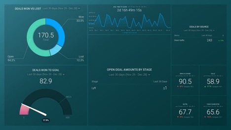
An example of a Databox reporting dashboard.
Tableau
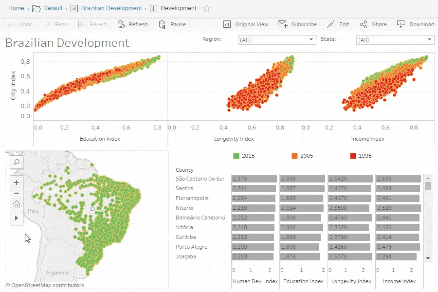
Tableau is very popular with medium to large enterprise organizations that are looking for a powerful data visualization solution without the heavy manual lift required to configure it. The tool offers tremendous flexibility with a wide range of visual assets available. It is very mobile-friendly and allows for easy data blending. It offers access to extensive data analytics, including IT, government, marketing, and more. One of the more powerful features is its ability to perform real-time data analysis right in the dashboard itself. For those who want further customization, Tableau offers the ability to create JavaScript extensions and APIs for custom reports through JavaScript charting libraries.
Tableau offers a wide selection of visualizations to best represent the value hidden in your data.
Zoho Analytics
One of the most popular tools available, Zoho Analytics is targeted to the large enterprise. However, it’s also suitable for some mid-sized businesses, depending on your needs. It offers one of the most powerful platforms for creating highly visually appealing reporting options and boasts a very intuitive and user-friendly dashboard. The data security policies are some of the strongest available in the market today. Additional features include the ability to embed reports and dashboards into websites and social media channels, extract data from multiple sources with ease, and take advantage of AI-based assistance during the data visualization process. It is one of the more expensive solutions available, so these bells and whistles do come at a cost.
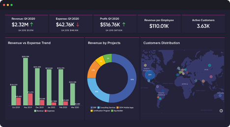
Zoho Analytics caters to the data visualization needs of the large enterprise
There truly is a science and an art to effective data visualization. As the tools and technology continue to evolve to be ever-more user-friendly and accessible, the concept of the “citizen data scientist” continues to gain traction. It is more and more common to see marketing, IT, and business professionals adding this skill to their repertoire as they advance in their careers.
Fortunately, the latest research estimates that data visualization and analytics tools provide a significant return for every dollar spent. So, it makes sense to invest in a tool that will help you find and extract the digital gold hidden in the mountains of all that raw data.
Effective data visualization requires robust and accurate data
No matter where you are on your data visualization journey, it’s critical that your data is in tiptop shape first. After all, you can have the most powerful data visualization in the world, but if your data isn’t accurate — or even complete — the story you’re trying to tell with your data won’t hold up to a reality check. Or worse, you could make strategic business and marketing decisions based on faulty data.
In today’s increasingly data-centric world, managing and making sense of your marketing data can be an overwhelming prospect. The steps of acquiring, organizing, storing, and enriching data collected from various sources and points in the customer journey — not to mention managing privacy compliance — are all critical aspects of managing data effectively and responsibly.
Our Data Services offerings, which range from data audits, enrichment, segmentation, and deduplication to privacy and compliance services, can help you create a solid data foundation to help you advance your business and marketing goals and objectives. And if you’d like some help jump-starting data visualization within your organization, DemandGen Expert Services can provide the support you need.
 As a Client Engagement Manager, Mike Jacobanis works closely with clients to understand their objectives and guide projects to successful completion. With over 20 years working with digital agencies and the large enterprise, his broad expertise spans demand generation, lead generation, marketing automation, database marketing, and marketing operations. His early experience as a software developer serves as a solid foundation for coming up with forward-thinking technical solutions to solve even the most complex business challenges.
The post Are You Getting the Most Value from Your Digital Gold Mine? Data Visualization Can Help. appeared first on DemandGen.


